Laura Ketting Putiton - The 1% Business Platform
January 19, 1994
Introduction
A creative tornado full of ideas, that is how I would describe myself. I’m a maker, a do’er. I work analogue most of the time because I want to convey a piece of myself to the design. Furthermore, I often start a project with my own fascination, with something that has my interest.
Graphic design is an unloading valve for me in which I can create what I have in my head, and communicate this to others. Communicating my work is something which I find very important. With my work, I want to convey the audience with an experience. I want to give them an insight in my view on things.
As a designer, I am focussed on the process within a project. I am fascinated by typography. This is a topic which comes back in every project I create. It is important for myself to keep on challenging myself and go a step further every time.
Early life and education
Beyond Letters – Exploring Form, Process & Meaning
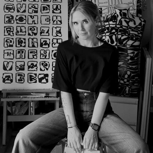
Laura Ketting, an experimental artist from Rotterdam, is renowned for her innovative approach to graphic design and typography. As a graphic designer and typographic artist, she extensively uses diverse materials in her work, uniquely influencing the readability of the letters. For Laura, it’s not about creating perfectly readable letters but about developing a unique experience where the letters themselves take center stage.
By choosing only black and white, she focuses entirely on the form and structure of the letters, bringing the essence of typography to the forefront. This minimalist color palette ensures that the viewer can fully immerse themselves in the images and letters Laura creates. She plays with contrasts and textures, making each letter a work of art in itself.
The process plays a crucial role in Laura’s work. She draws inspiration from making mistakes within the process, as these often lead to unique outcomes. Laura’s work invites exploration and wonder. The combination of materials and the monochrome approach ensures that her letters and images offer a visual experience in which one can get lost.
Her art challenges the viewer to look beyond the traditional boundaries of typography and discover the interaction between form, material, and meaning.
Career trajectory
busy editing
Legacy and future
Workshops & Talks
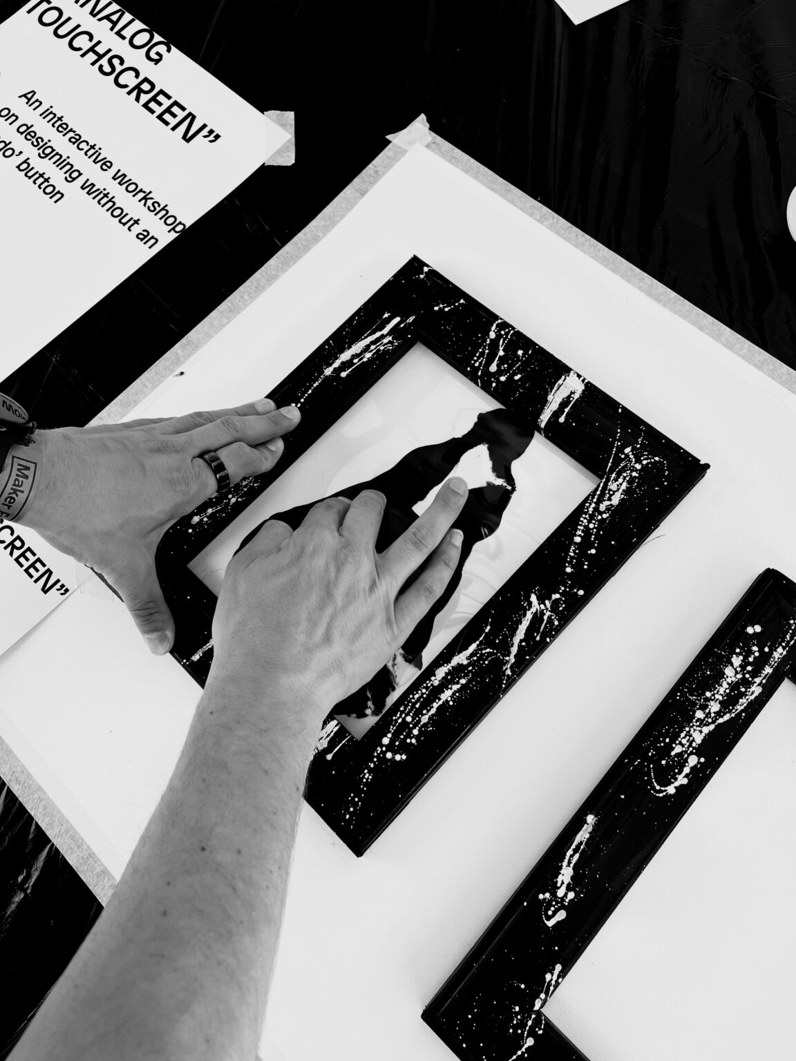
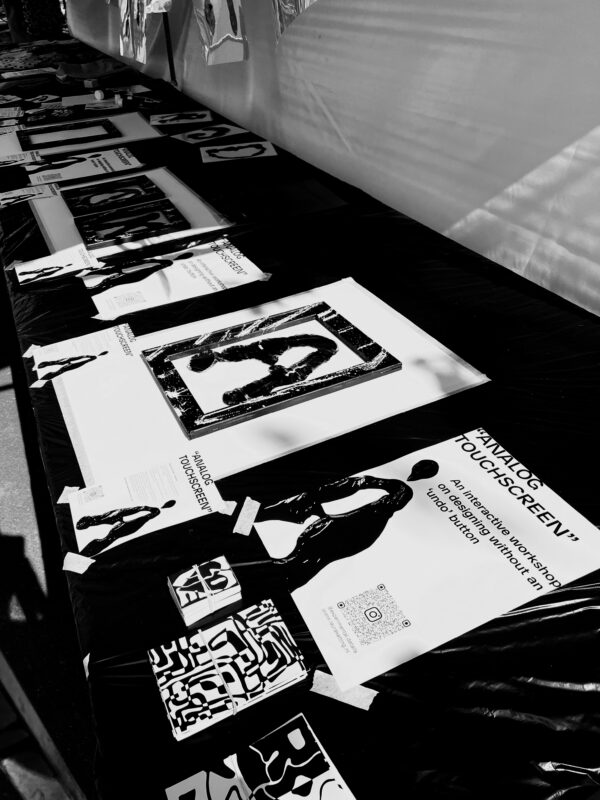
In addition to her work as a graphic designer and artist, Laura Ketting also gives workshops and talks. This began with her graduation project, where she explored legibility in typography and how shifting perspective can open up new ways of thinking and creating.
In her workshops, Laura invites participants to look at their surroundings differently, searching for shapes that resemble letters, like a fence that looks like an A. These found forms are then traced, transformed, and expanded into complete alphabets, which can even be turned into usable typefaces. All in black and white, to keep the focus purely on form.
This method trains the brain to see differently. By simply starting to make, you’ll begin to see more and more.
By making you will see, by seeing you will make.
In her talks, Laura shares more about this process and her creative mindset. In the workshops, participants dive in and experience it for themselves.
Interested in booking a workshop or talk?
Feel free to get in touch via email: hello@lauraketting.nl
References
busy editing